
Pressure, Mesh, Pop: The Silkscreen Method
Silkscreen printing is the engine of contemporary pop art—crisp edges, saturated color, and deliberate craft. This bilingual guide demystifies the process, materials, edition signals, condition risks, and framing so collectors can read prints with confidence.
Pop art’s graphic punch often begins at the screen. Silkscreen printing—also called screenprint or serigraph—pushes ink through a mesh stencil to build color in layers. The results can be dazzlingly flat, vibrant fields or subtly textured passes, each carrying the signature rhythm of pull, flood, repeat. For collectors, understanding that rhythm is the difference between simply liking a print and truly reading how it’s made.
Contemporary artists and master printers have refined the process: tighter registration, specialized inks, and papers that hold color with authority. The craft is exacting but not mechanical—choices around mesh, squeegee pressure, and drying times shape the character of every impression. Even editioned works contain small, telling variations that reward close looking.
How Silkscreen Works
At its core, silkscreen uses a mesh (often polyester) stretched on a frame. A light‑sensitive emulsion blocks areas that will not print, leaving open cells where ink can pass. Each color typically gets its own screen. The printer floods the screen to charge it with ink, then pulls a squeegee to press ink through the open image onto paper.
Because colors are built in passes, order matters. Translucent inks can shift dramatically over earlier layers; opaque inks can bury errors. Pop works favor spot colors for punchy solids, but halftones and gradients are possible via dot patterns and split‑fountain pulls. Compared to digital prints, silkscreens often reveal a tactile topography—raised ink edges and slight overlap—visible in raking light.
Inks, Papers, and Sheen
Inks range from water‑based to solvent and UV‑curable. Opaque pigments deliver dense blocks; transparent colors glaze and mix optically. Fluorescents glow but are more light‑sensitive. Metallic and pearlescent inks add sparkle; varnish passes can unify gloss or create selective sheen.
Paper is the print’s stage. Cotton rag sheets (by weight and sizing) influence saturation, edge crispness, and drying. Heavier stock tends to resist cockling from wet layers. Coated papers yield sharper edges and higher gloss; uncoated sheets give a velvety surface. Artists may also print on canvas, acrylic, or aluminum for specific effects.
Featured Works
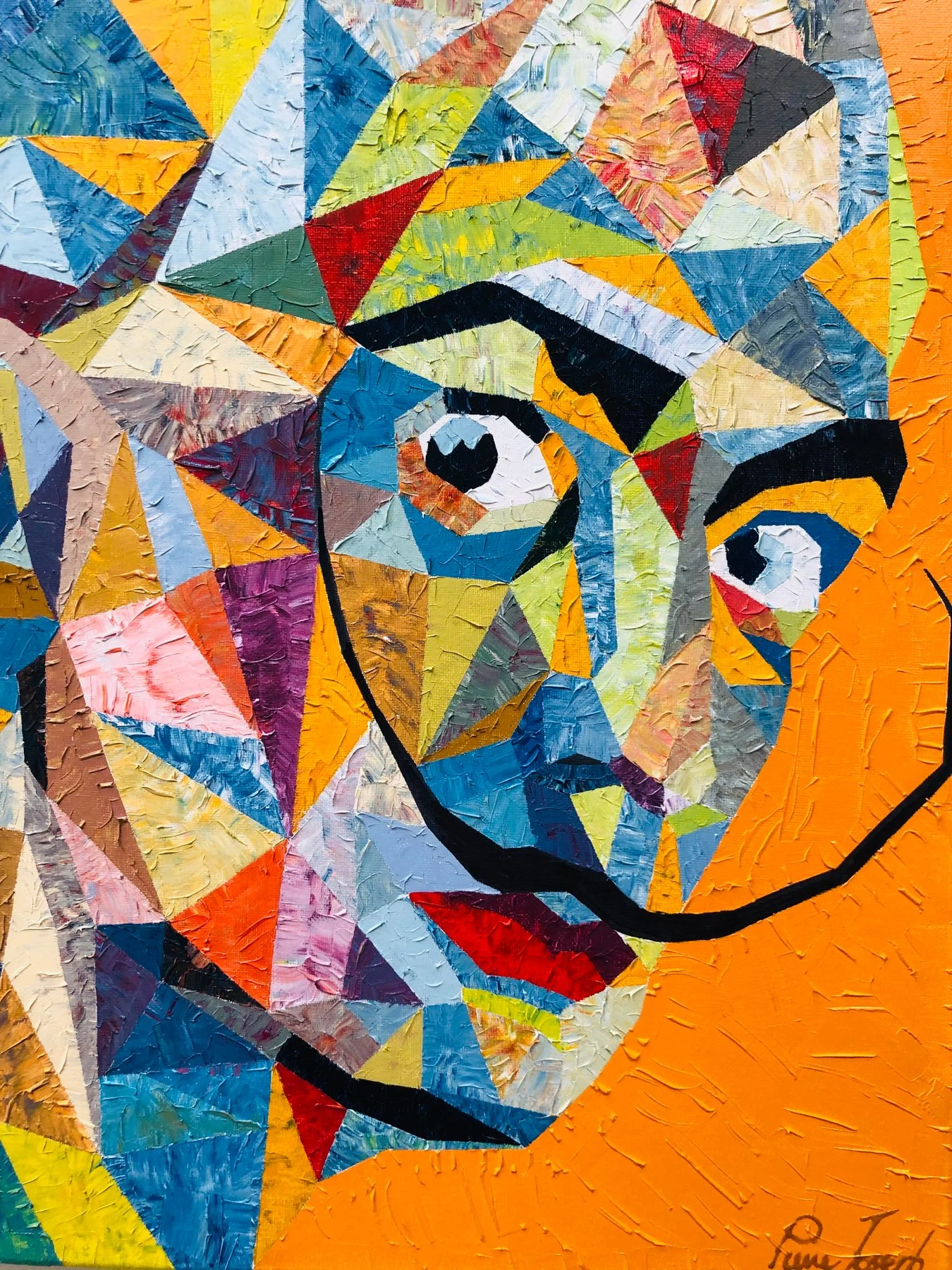
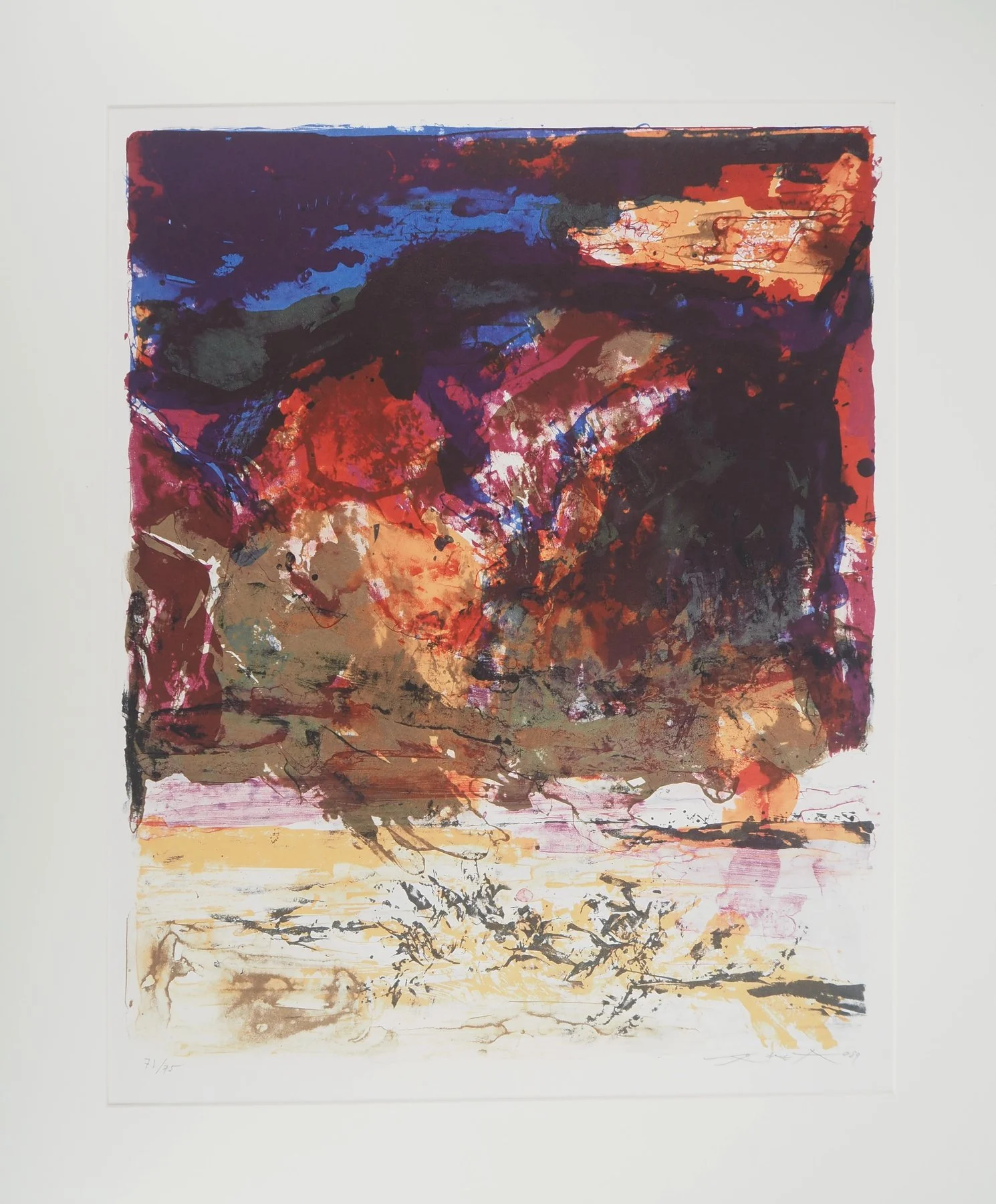
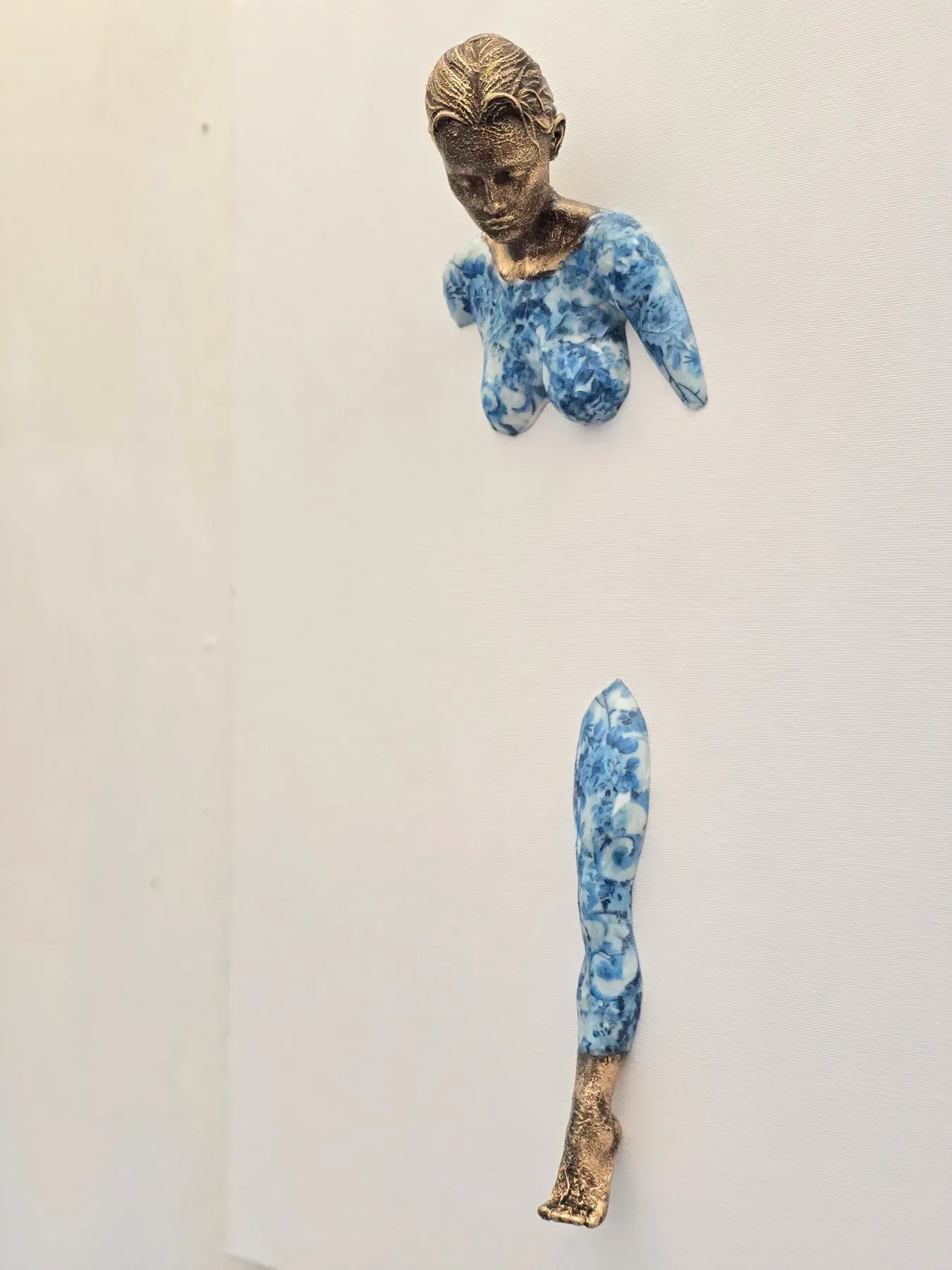
Registration and Color Strategy
Registration is the choreography that aligns layers. Printers use pin systems, guides, and printed crop marks to hold position. Minor misregistration—visible as slim color fringes—can be either a flaw or a deliberate vibrato, depending on the artist’s language. Perfect alignment with razor‑sharp edges is common in Pop traditions and requires disciplined setup and drying.
Color strategy shows up in trapping (tiny overlaps to prevent white slivers), keylines (a dark outline unifying forms), and halftone choices (dot size and angle). Watch for split‑fountain gradients—two colors loaded on the same screen blending along the pull—which can introduce beautiful, controlled unpredictability.
Edition Signals for Collectors
Edition numbers communicate scarcity and production intent. Look for the fraction at the margin (e.g., 3/50), a signature (often graphite), a title, and sometimes a date. Printer and publisher chop marks or blindstamps add credibility; a certificate of authenticity supports provenance. You may also encounter AP (artist’s proof), PP (printer’s proof), or HC (hors commerce) notations—each with distinct conventions. For a deeper refresher on numbering logic, see "Numbers, Scarcity, and the Print Promise".
Because technique shapes value, connoisseurship matters. Layer counts, complexity of registration, special inks, and condition all influence desirability beyond raw edition size. For an expanded look at the craft itself, our technical primer offers further detail: "Pull, Flood, Repeat".
Condition Risks and Care
Screenprints wear their history. Thick ink films can scuff, crack at folds, or offset if stored under pressure. Fluorescents and some dyes fade faster; check for uneven exposure. Paper can show handling creases, edge dings, or slight waviness from moisture. Examine in raking light to catch abrasions and check the verso for tape residue or acidic mounts.
For storage, keep prints flat in archival folders with interleaving that does not stick to inks (many prefer unbuffered tissue over glassine for heavily inked surfaces). Stable humidity and cool temperatures guard against paper movement and mold. Handle with clean gloves and support the sheet fully—never pinch corners.
Framing that Protects
Use archival hinge mounts (Japanese paper and reversible paste) rather than full adhesive backs. Allow a generous window mat or spacers to keep the print off the glazing—thick ink areas can block to glass or acrylic. Opt for UV‑filtering acrylic to reduce breakage risk and cut UV exposure; avoid direct sunlight entirely.
A sealed, acid‑free backing and a frame depth that accommodates the sheet without pressure help prevent warping and abrasion. If the print includes metallics or thick varnish, ask your framer about static‑safe glazing and micro‑spacers to avoid surface contact.
Conclusion: Silkscreen rewards the slow look. Ask who printed the work, how many colors it carries, what inks and paper were chosen, and how the edition was managed. Inspect registration, surface texture, and condition under good light. Pop’s gloss is built on method; reading that method turns pleasure into knowledge—and knowledge into confident collecting.
EN Collector’s note: You will often encounter silkscreens by artists such as Takashi Murakami, whose Pop vocabulary pairs brilliantly with layered color. Read the craft, then let the joy follow.