
Pull, Flood, Repeat: Silkscreen Craft in Pop Art
Silkscreen printing is the heartbeat of contemporary pop art—precision meets pulse, craft meets culture. This bilingual guide explains how screens, inks, and editions shape value, with practical tips for buying, caring for, and confidently collecting screenprints.
The Pop Silkscreen Toolkit
Silkscreen printing—also called screenprinting—is central to pop art’s visual language because it turns everyday imagery into vivid, repeatable icons while preserving tactile craft. In the studio, artists translate drawings or digital files into stencils, pull ink through mesh with a squeegee, and build colors layer by layer. The result: a print that is simultaneously democratic in accessibility and exacting in execution.
Pop art’s power lies in clarity, contrast, and cultural recognition. Silkscreen amplifies those traits by enabling punchy color fields, crisp edges, and deliberate repetition. For collectors, understanding the process is not trivia; it’s a roadmap for reading quality, scarcity, and care.
Mesh, Stencil, and Ink Basics
At the core are three variables: mesh, stencil, and ink. Mesh count (threads per inch) affects detail: higher counts favor fine lines and halftones; lower counts lay down thicker, more saturated ink. Stencils are created with light‑sensitive emulsions or hand‑cut films, controlling where ink passes. Inks range from water‑based to acrylic and specialty metallics; fine art prints typically use archival, pigment‑rich formulas for stability.
Collectors can ask: What mesh and ink were used? Was the stencil photo‑exposed or hand‑cut? Answers won’t be uniform across artists, but they signal intention. A well‑pulled print shows even ink deposition, clean edges, and no unintended smudging.
Color Layers and Registration
Each color generally requires its own screen. Registration—the alignment of layers—determines whether a print feels precise or purposefully off‑kilter. Tight registration produces razor‑sharp overlaps; playful misregistration can introduce energy. Look near corners for subtle registration marks on proofs or workshop prints (final editions usually trim these away).
Advanced studios blend transparent inks to create new hues where layers meet, use halftone dots for gradients, or add gloss and matte varnishes to modulate shine. Metallic inks and fluorescents are common in pop contexts; they should be laid evenly without banding or dull patches.
Paper, Canvas, and Substrates
Most fine art screenprints use cotton rag or archival papers. Heavier weights resist warping, and deckle edges often appear in premium papers. Canvas screenprints exist, though the weave demands careful ink control. Synthetic substrates can add durability but may shift surface sheen.
Collectors should handle works with clean, dry hands, support the sheet fully, and avoid rolling tightly. If a print arrives rolled, let it acclimate before flattening. Ask about paper brand, weight, and whether the inks are rated as lightfast.
Editions, APs, and Scarcity
Edition numbers communicate scarcity. A notation like 12/50 means the twelfth print out of a total edition of fifty. You may also see AP (Artist’s Proof), PP (Printer’s Proof), or HC (Hors Commerce); these are outside the numbered edition and typically limited. Understanding the hierarchy of proofs helps you evaluate value and rarity. For a deeper dive into edition logic and collecting signals, see Numbers, Scarcity, and the Print Promise.
Always look for clear edition info, a legible signature (often in pencil), a date if provided, and a reliable certificate or gallery documentation. Consistency between the sheet, the back label, and the paperwork strengthens future provenance.
Craft Signals for Collectors
Screenprints carry telltale signs of care and skill. Examine:
- Edges: Crisp stencil boundaries without feathering or seepage. - Surface: Even ink layers; acceptable texture from ink weight but no unintended ridges. - Color: Clean registration; intentional overlaps; no unplanned halos. - Paper: No cockling from moisture; minimal handling dents.
Compare multiple works by the same artist to learn their “house” craft standards. Artists working in pop languages across media—such as Takashi Murakami, Karl Lagasse (1981), naor, or Joaquim Falco (1958)—often bring edition clarity and bold imagery to printmaking or companion formats, reinforcing the visual coherence collectors value.
Featured Works
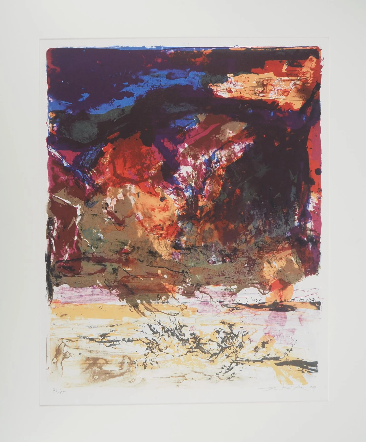
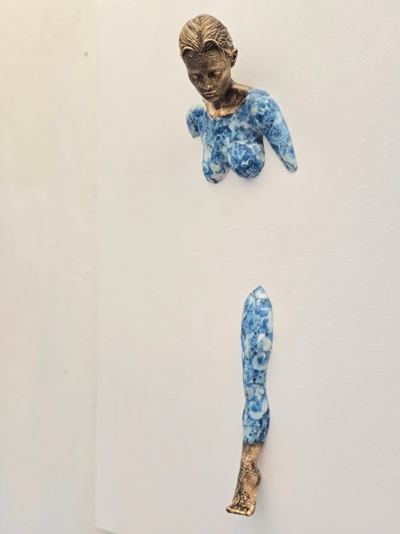

Care, Framing, and Longevity
Protect prints from UV light with museum‑grade glazing (UV acrylic reduces weight and shatter risk). Use acid‑free mats and backing, add spacers to prevent the sheet from touching the glazing, and avoid direct sunlight, high humidity, and temperature swings.
For storage, keep prints flat in archival sleeves or between acid‑free boards. If transport is necessary, roll around a large‑diameter tube with interleaving, not tight coils. Cleaning should be left to professionals; never use household cleaners or sprays.
Cultural Context and Market Today
Silkscreen sits at the intersection of reproducibility and ritual. In the post‑NFT climate, collectors increasingly prize the tactile intelligence of prints—the evidence of layers, pressure, and choice. Pop art’s shared imagery thrives in this medium: it speaks quickly yet rewards close looking. For a broader view on how pop symbols shape value today, see The Currency of Images: Pop Icons and Value in Post‑NFT Contemporary Art.
Practical buying tip: match your taste for imagery with respect for process. Seek strong edition documentation, visible craft decisions, and papers/inks engineered for stability. Calibrate expectations—smaller editions are not automatically “better,” and larger editions can still be meaningful if technique and cultural resonance are high.