
Affordable Postwar Art Prints: A Curated Guide
Affordable postwar art prints unite rigorous craft with cultural clarity. This bilingual guide explains history, techniques, editions, and condition—positioning collectors to select works that endure beyond trends.
The decades after 1945 produced a profound reset in the languages of art. Artists turned away from spectacle toward clarity: light, rhythm, material, and the discipline of serial form. Within this shift, affordable postwar art prints emerged as a democratic yet exacting field—objects that marry studio intent with the technical intelligence of professional print workshops. For new and seasoned collectors alike, the category offers a way to live with canonical ideas while learning to read paper, ink, and edition signals with connoisseurship.
When we speak of affordable postwar art prints, we are describing a broad terrain: lithographs, etchings, aquatints, screenprints, and related techniques produced in the decades following World War II. These works carry the discipline of their movements—ZERO’s luminous restraint, Minimalism’s measured cadence, Pop’s graphic lucidity—into sheets of paper whose intimacy rewards close looking. The result is a domain where price and presence can align, if you know what to watch for.
After 1945: Prints Reset
Postwar printmaking thrived because it answered an artistic and ethical need. Many artists sought a new beginning in which material precision replaced gesture and rhetoric. Printmaking’s inherent seriality, its balanced tension between hand and system, suited this ethos. Atelier expertise—lithography stones, copper plates, silkscreens—provided infrastructures where artists could refine ideas into repeatable yet subtly variable results.
European and American studios professionalized this craft, enabling artists across movements to develop distinct paper-based languages. The ZERO orbit pursued light, rhythm, and surface; Minimalism favored clarity and interval; lyrical abstraction explored breath and wash. Meanwhile, Pop’s embrace of the screenprint aligned art with the explicit clarity of contemporary image culture. Throughout, the print remained more than a reproduction—it was a site of invention in its own right.
Materials, Marks, Editions
Materials are your first language. In lithography, greasy drawing or tusche on stone or plate yields a tonal, sometimes almost brush-like range. Etching and aquatint translate incised lines and powdered-resin tonal fields into papers marked by a plate impression—look for a beveled platemark and slight embossment. Silkscreen (serigraphy) excels at opaque, saturated color fields and crisp edges; color layers are typically discrete and flat.
Papers matter. Cotton rag supports age well; watermarks can signal quality and origin. A publisher’s blindstamp or dry stamp often appears in a lower corner; it records responsibility and a standard of craft. Inks vary from oil-based richness to water-based transparency; density, evenness, and registration accuracy reveal workshop care.
Edition clarity belongs at the core of print literacy. Standard numbering appears as a fraction (for example, 15/75) at lower left or right, balanced by a pencil signature when applicable. You may also encounter AP (artist’s proof), EA/ÉA (épreuve d’artiste), or HC (hors commerce)—proofs outside the main numbered run, sometimes scarcer but not automatically more valuable. Publisher records, workshop chops, and watermarks corroborate authenticity more reliably than any single certificate.
ZERO And Minimal Languages
For postwar reductionist aesthetics, prints were never an afterthought. They are laboratories for light, interval, and touch. Within the ZERO movement—so decisive for European postwar art—many artists pursued a lucid material economy that translates naturally to works on paper: monochrome structures, rhythmic grids, ritual repetitions, and tactile relief effects interpreted via embossing, fine screens, or restrained tonalities.
The essential lesson is that the print can carry the same conceptual weight as a relief or painting, but with a gentler footprint in space and budget. In our program, Bernard Aubertin is emblematic of this clarity—his elemental vocabulary of red, nail, and flame resonates in multiples and paper-based works, where process and ritual remain palpable. For a wider view on how collectors position ZERO within long-term value, see Investing in ZERO Art: Works with Potential.
Minimalist sensibilities—measured intervals, serial geometry, disciplined silence—also find a natural home in editions. Here, embossing can become a structural event, grids become breathing spaces, and the paper’s surface acts as a primary field rather than a neutral support. The affordable print, in this context, is not a compromise but a distilled proposition.
Pop Seriality, Neo‑Pop Echoes
If ZERO and Minimalism affirm reduction, Pop declares the clarity of the image. Screenprinting’s leveled planes, decisive contours, and calibrated color separations generated a grammar fit for a mass-media century. Many postwar Pop editions remain within reach, especially when you look beyond headline names to publishers’ projects and carefully produced portfolios.
This language continues today in neo-pop practices, where serial surfaces and bright chroma converse with consumer culture. Contemporary echoes—such as those by Takashi Murakami—demonstrate how screenprint logic remains a precise tool for building saturated, impeccably edged images. For a deeper dive into the craft behind those crisp planes, see Pull, Flood, Repeat: Silkscreen Craft in Pop Art.
Featured Works
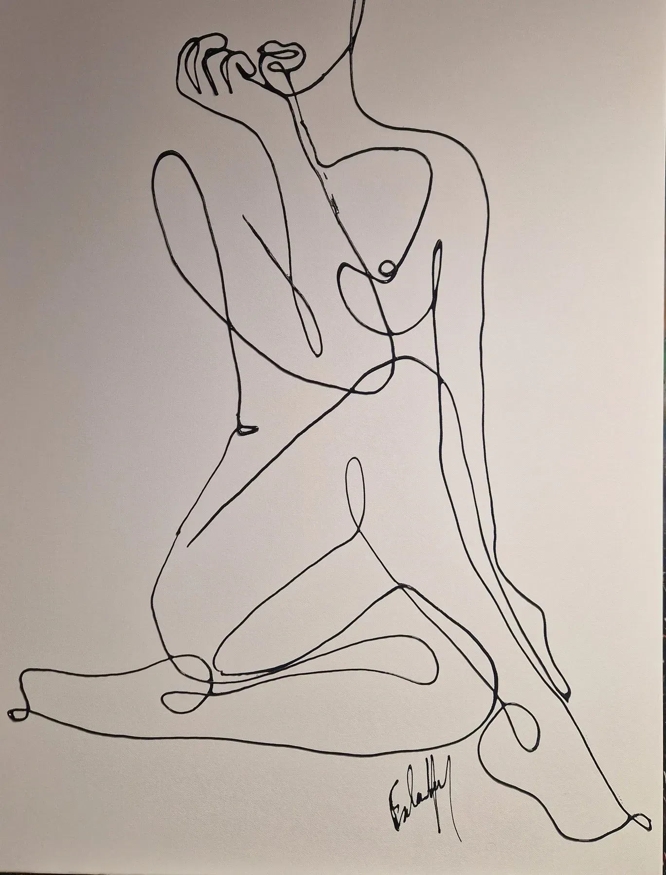
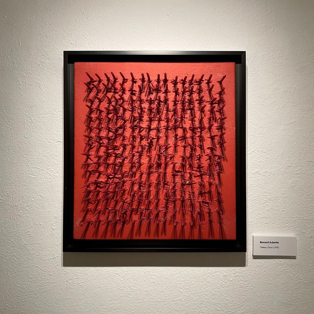
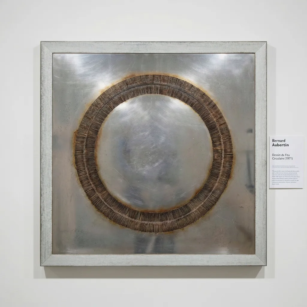
Affordable postwar art prints today
Affordability in postwar prints does not mean lesser art; it often signals a confluence of medium, edition size, and market attention. Lithographs and etchings by artists anchored in major movements can offer notable value where paintings or unique works have accelerated beyond reach. Explore curated selections in Lithographs to compare papers, publishers, and edition clarity side by side.
Look also to works on paper by artists whose reputations are secure but whose print catalogues remain under-read. Editions tied to respected publishers and workshops carry durable signals of craft. Portfolios or series can be especially compelling: variations across sheets educate the eye and concentrate an artist’s language at approachable price points.
Finally, practice patience. The market for postwar editions is broad, and compelling examples surface regularly. Train your attention on materials, workshop chops, and condition before you weigh signatures or scarcity alone. Connoisseurship, more than timing, is what makes affordability endure.
Condition, Framing, Preservation
Condition is a language of light, humidity, and time. Common risks include mat burn (acidic borders from old mounts), overall paper toning, foxing (small brown spots), handling creases, and lightstruck fading. None of these are automatic deal-breakers; severity and reversibility matter. A professional condition report will describe the sheet’s tone, margins, and any restorations with specificity.
Framing should be archival and reversible. Use 100% cotton or museum boards, hinged with Japanese paper and conservation adhesive. UV-filter glazing is advisable, especially for dye-based inks. Avoid direct sunlight and large humidity swings. If storing unframed, interleave with acid-free tissue and keep flat. Thoughtful care preserves both surface beauty and the integrity of fibrous papers.
Reading Artists Through Prints
Prints reward close looking because they compress decision-making into layered procedure. Consider how a ZERO sensibility discloses itself through embossment or a faint vibration across a monochrome field. Observe how a lyrical abstractionist translates breath-like washes into lithographic tusche, or how a pop vocabulary stabilizes into precise bands of saturated color.
Artists in our program provide instructive contrasts. Zao Wou-Ki (赵无极)—a master of East–West abstraction—found in lithography and intaglio an arena where drifting atmospheres and calligraphic energy could co-exist with rigorous craft. Bernard Aubertin demonstrates the opposite pole: ritual minimal means generating maximal intensity. Together, such cases show why postwar prints are not footnotes but primary texts.
Selecting With Purpose
A measured collecting path starts with three checks: material intelligence, edition clarity, and condition. Material intelligence asks: does the technique amplify the artist’s language? Edition clarity asks: are numbering, signature, and publisher marks coherent and documented? Condition asks: does the sheet preserve the work’s chroma, surface, and margins without intrusive damage?
From there, consider provenance and presentation. Works that have circulated through careful hands—publishers, galleries, or exhibitions—often carry stronger supporting documentation. Presentation matters because it governs longevity; a well-framed print lives more vibrantly and safely over time. Align these signals with your own visual priorities, and affordability transforms into sustained pleasure rather than short-term savings.
In the end, affordable postwar art prints offer a rare equilibrium: cultural gravity, demanding craft, and tactile intimacy in formats that meet domestic life. Read them with patience, collect them with care, and let their measured surfaces reset the pace of the room.