
Art Gallery Vienna: Contemporary Prints Buy Guide
Vienna’s print culture—from Secession graphics to today’s editions—offers collectors depth and discipline. This guide explains materials, editions, movements, and care so you can buy contemporary prints in Vienna with clarity.
Vienna rewards the attentive eye. For collectors searching “art gallery vienna contemporary prints buy,” the city offers an elegant confluence of printmaking heritage, curatorial rigor, and an audience that values both culture and craft. In a landscape shaped by the Secession’s lucid graphics and the Viennese devotion to applied arts, contemporary editions arrive with high expectations: they must marry precise technique with resonant imagery, and carry the documents and details that underpin lasting value.
The purpose of this guide is practical and curatorial. It translates material choices, edition signals, and movement contexts into clear reading strategies for Austria‑based buyers. You will find methods to examine surfaces and inks, to parse signatures and numbering, to connect prints to postwar and contemporary lineages—from ZERO’s reset to the sharp chroma of Neo‑Pop—and to care for works so their light remains intact for decades.
Vienna’s Print Lineage
Vienna’s modern identity was shaped by artists who understood the public reach of printed images. The Secession’s poster culture and the design intelligence of the Wiener Werkstätte established an ethos: editions could be both democratic and exacting. This history matters for contemporary collectors because it set a bar for clarity—materials should be well chosen, information transparent, and the edition’s purpose legible in the final object.
Today’s Viennese galleries often extend that lineage by presenting prints not as secondary to painting, but as sites where process, color, and rhythm are distilled. Screenprints and lithographs become engines of precision; etchings and photopolymer plates capture tonal nuance; pigment prints test the edge between photography and abstraction. In each case, the city’s collecting culture favors works whose craft is as articulate as their concept.
Materials, Matrices, Inks
Knowing the matrix clarifies what you’re buying. Lithography (planographic) uses a flat stone or plate; it yields supple tonal transitions and crisp lines, especially on heavy rag papers. Screenprint (stencil) delivers saturated fields and razor edges, ideal for Pop and Neo‑Pop languages. Intaglio (etching, aquatint, drypoint) presses ink from incised lines, rewarding close looking with micro‑relief and inky glow along the plate mark. When browsing editions, you’ll often encounter lithographs in Vienna; for focused viewing, see our Lithographs.
Paper is a silent protagonist. Look for 100% cotton, pH‑neutral sheets from reputable mills; deckled edges can signal full margins, but always confirm measurements. In screenprint, opaque inks should sit with confident, even saturation; in lithography and intaglio, a slight emboss or plate mark and the presence of printer’s chop marks help authenticate studio practice. For pigment prints, ask about the ICC color profile, inkset, and substrate; archival baryta papers or cotton rag supports indicate an intent toward permanence.
Edition markings carry meaning. Typical order places the fraction (e.g., 12/60) at lower left, title center (if present), and signature/date at lower right. Variations exist—some artists sign verso or within the image—but consistency within the artist’s practice is key. Printer’s chops, publisher embosses, or blind stamps are strong signals of professional production.
Reading Edition Signals
Numbers inform scarcity but not desirability alone. A 300‑edition screenprint by a sought‑after artist can outpace a 25‑edition etching by a lesser‑known name if the image is iconic, the color sequence exacting, and the cultural charge strong. Read the whole field: edition size, the presence and quantity of artist proofs (AP), printer’s proofs (PP), and hors commerce (HC), plus documentation such as certificates and publisher invoices.
Margins and condition merit slow looking. Sun toning creates a halo near former mats; scuffs and handling creases often hide in dense color fields; offsetting can occur when stacked unprotected. Ultraviolet protection in glazing is essential, but so are correct hinges: Japanese paper with reversible wheat‑starch paste, applied to the sheet’s margins rather than the image area. Ask the gallery to describe any prior restoration work and to provide condition notes.
Provenance and printshop reputation add ballast. A work printed at a respected workshop or published in conjunction with a curated project carries signals of peer scrutiny. For screenprint fundamentals, our technical overview in Pull, Flood, Repeat: Silkscreen Craft in Pop Art clarifies how pressure, mesh, and squeegee technique translate into surface quality.
Movements Shaping Vienna Demand
Vienna’s market is plural: it values historical continuity and fresh voices. Three currents shape collector attention for prints today. First, postwar reduction—especially the European ZERO context—speaks to the city’s appetite for clarity, rhythm, and material light. In this arena, works connected to artists like Bernard Aubertin reward study through their distilled language, even when the medium extends beyond classical printmaking. For a collecting lens on this field, see Investing in ZERO Art: Works with Potential.
Second, Neo‑Pop and Superflat languages—whether lucid flowers or cultural icons—thrive in print form because the matrix loves edge and saturation. Here, editions by Takashi Murakami exemplify how serial images can remain vivid while rigorously crafted. Third, contemporary abstraction continues to channel material intelligence: layered lithographs and etchings test how color and gesture meet paper. The East–West poetics around Zao Wou-Ki (赵无极) remind us that works on paper can carry monumental feeling at domestic scale.
Featured Works
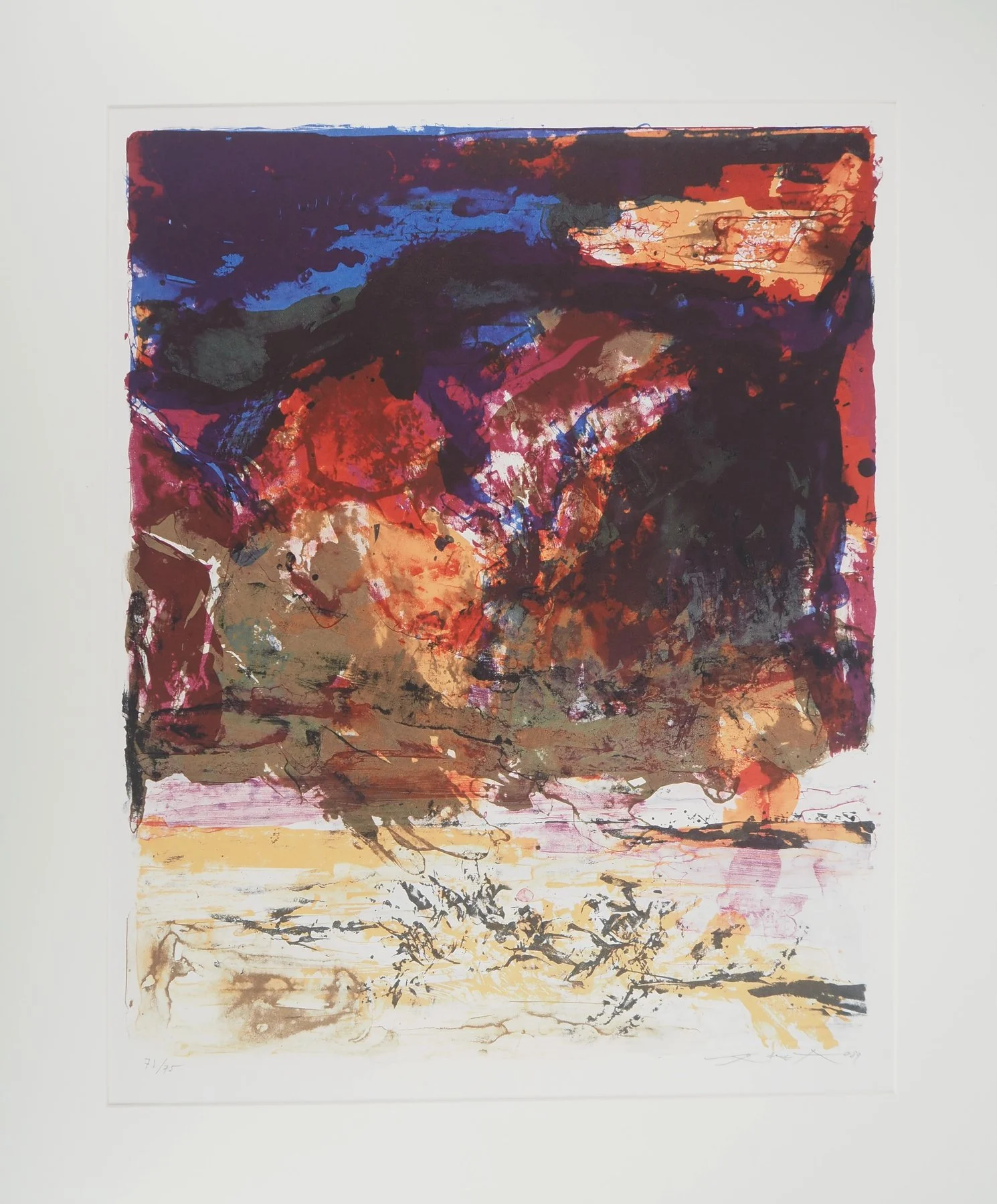
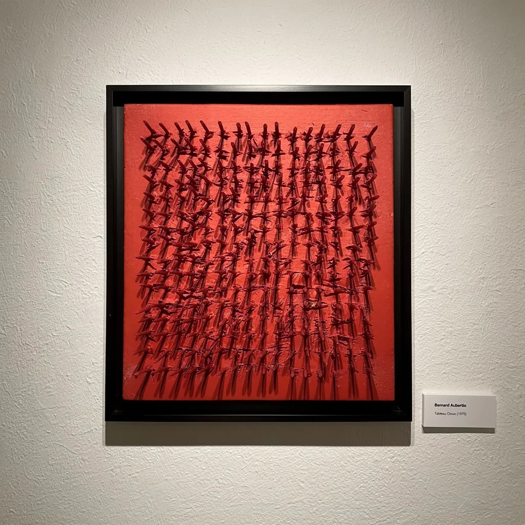

Art gallery Vienna contemporary prints buy
Approach the visit with a method. Before arriving, request a checklist: full title, year, medium, edition size and breakdown (AP, PP, HC), sheet and image dimensions, printer/publisher credits, and framing details if applicable. Ask for high‑resolution images under raking light; it reveals surface quality and any handling marks. On site, compare the signature style across multiple works; consistency is telling.
For Austria‑based collectors, logistics matter. Clarify invoicing details and export or intra‑EU shipping terms if relevant; ask how the work will be packed (corner protectors, glassine interleaves, rigid boards). If framed, confirm glazing type (UV‑filter acrylic or glass), backing board acidity, and spacer use. If unframed, request archival sleeves or tubes of adequate diameter with end caps and interleaving to prevent ink offset.
Buy with context, not just desire. Seek images that sit within an artist’s recognized vocabulary—motifs that recur—and weigh whether the print’s colorway or plate state aligns with the canonical versions. Balance edition size against demand signals: a moderate run by a major name, with strong publisher provenance, often holds best in Vienna’s deliberate, research‑forward collecting culture.
Care, Framing, Display
Light is the print’s friend and enemy. Keep UV exposure low with museum‑grade glazing; rotate walls if a room receives seasonal brightness. Float mounting preserves deckled edges, but the hinges must be reversible and sparing; window mounting suits works that require full support across the sheet. Use 100% cotton museum board, free of lignin, and ensure the frame has a dust seal to stabilize the microclimate.
Placement is part of conservation. Avoid radiators and kitchens; maintain stable humidity and temperature; leave a slim air gap between frame and wall to prevent condensation. For works with heavy ink laydown (screenprints with dense blacks), allow thorough curing time before framing to avoid adhesion to glazing. Periodically inspect margins and verso; early detection of foxing or waviness keeps intervention minimal.
Price, Rarity, Judgment
Pricing in Vienna reflects a studied balance of craft, culture, and scarcity. Trained eyes look beyond the fraction. They favor impeccable impressions, clean margins, authoritative provenance, and images that occupy central positions within an artist’s oeuvre. An edition can be large and still be compelling—if it delivers the artist’s essential language with exacting production and strong curatorial framing.
Collecting is cumulative judgment. Keep coherent notes on each work you consider: materials, condition, context, and your lived experience of the image at home. Over time, Vienna’s rhythm—its preference for clarity and continuity—tends to reward prints that embody both technical command and cultural resonance.
Conclusion
Vienna’s print scene invites patience and precision. Read the sheet, the ink, the numbering, the publisher’s marks; situate the image within movements that the city values; and frame for light and longevity. When you buy contemporary prints in a Vienna art gallery, you join a lineage that balances intimacy with intellect. If a work’s craft and context hold under slow looking, it will likely hold in the Austrian market—and in your life—for years to come.