
Seeing With Color: Abstraction and the Mind
Color is often the first thing we feel in abstract art. This guide translates color psychology into practical tools for collectors—covering perception, emotion, materials, display, and buying strategies—so you can select and live with works whose chromatic power endures.
Color is the first encounter in abstract art—before form or story, our eyes register hue, saturation, and light. Artists leverage this immediacy, crafting atmospheres where color becomes subject, structure, and emotion in one gesture.
Color psychology offers language for what we intuit. While responses to color vary with culture, context, and materials, consistent patterns help us read and collect with confidence. This article turns those patterns into actionable strategies you can use at home, in galleries, and over time.
How Color Shapes Perception
Three levers shape how we perceive color: hue (the color family), saturation (intensity), and value (lightness–darkness). Highly saturated reds and yellows grab attention; low-saturation blues and grays recede, creating calm. Dark values add visual “weight”; light values lift and open space.
Context strengthens or softens these effects. Warm light makes reds and yellows bloom; cool daylight favors blues and greens. Adjacent colors shift perception (a blue beside orange feels bluer). Test works under daylight and warm LED to learn how colors behave in your rooms.
Emotional Codes of Key Hues
General tendencies are useful: red signals energy and urgency; blue reads as expansive and tranquil; yellow carries brightness and alertness; green suggests growth and rest; black brings gravitas; white conveys clarity and pause. These are guides, not rules.
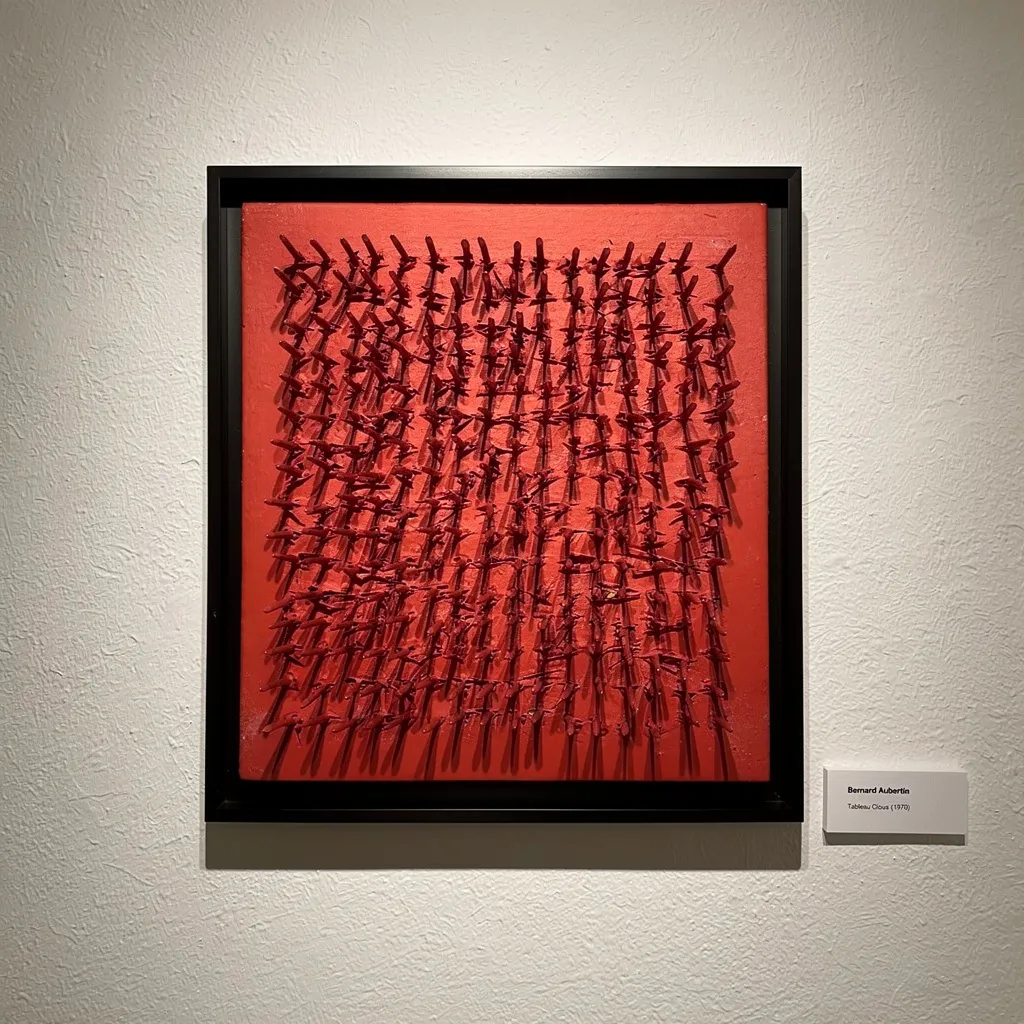
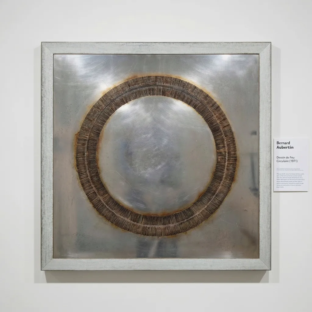
In practice, artists activate these codes with intent. Bernard Aubertin pushes red to ritual intensity in his monochromes—consider how that affects attention and tempo at home. For spacious blues and golds, Zao Wou-Ki (赵无极) offers luminous depth. For deeper reading, see Zero Heat: Bernard Aubertin’s Radical Calm and Ink, Light, Infinity: Collecting Zao Wou‑Ki.
Material Choices Alter Color Psychology
Materials mediate color. Oil paints often feel rich and deep; acrylics can appear cleaner and faster; ink carries fluid transparency; silkscreen inks read crisp and flat. Texture matters too: matte surfaces absorb light, softening hues; gloss reflects, amplifying saturation and contrast.
Finishes and framing also change perception. A heavy varnish increases sheen and depth; museum glass lowers reflection, clarifying subtle values in dark passages. Test framing options with color-sensitive works—you’re not only protecting the piece; you’re fine-tuning its psychological voice.
Reading Color in Abstract Collections
Evaluate color in person whenever possible. View at different times of day, then list what shifts: warmth, coolness, contrast, calm, or charge. Compare two works side by side to learn your thresholds for saturation and value—this builds a personal color vocabulary.
Display decisions carry weight. Neutral walls let colors lead; toned walls can build harmony or tension. Space bold pieces away from each other to avoid visual fatigue; cluster tonal families to create flow. Quality glazing with UV filtering preserves hues over time.
Featured Works
Collecting with Color Intelligence
Start with intention: define the emotional palette you want room by room. Map your daylight and artificial light, then select works whose color behavior complements that rhythm. Keep notes on how you feel with a piece across days—it’s a simple, powerful filter.
Buy for endurance, not novelty. A work whose colors feel balanced in both morning and evening will likely remain satisfying. Prioritize materials and presentation that protect color integrity. When color supports your daily experience, the artwork’s cultural and emotional value compounds.